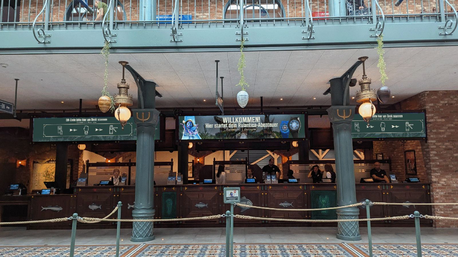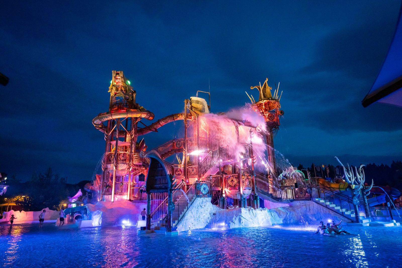
Rulantica is a world of adventure, but for visitors finding the right way was sometimes quite a challenge. Despite the beautiful theming, there was no consistency between the physical signposts in the park and the digital screens. There was no fixed style guide, so information came across as fragmented and guests struggled to find their way.
From bottleneck to insight
My approach started at the source: the guests themselves. By researching both first-time visitors and returning guests, I mapped out the biggest bottlenecks. Where do people get stuck? At what moment do they need information? And how do they currently deal with the confusion? These insights formed the basis for the next steps.
One consistent line in the design
To bring calm back into the communication, I first developed an extensive style guide. In it, I brought existing elements together and drew one clear line for the park's entire visual identity.
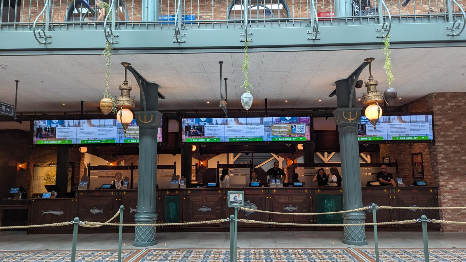
With these new guidelines as a foundation, I completely redesigned the digital signs above the ticket desks. The goal was simple: make sure visitors see what they need to know at a glance, without being overwhelmed.
Calm and clarity for the guest
The end result is a professional style guide the Rulantica team can rely on and a fresh design for the digital ticket desk information. I also gave targeted advice on the online and offline signage throughout the rest of the park.
For guests this makes a world of difference. Information is easier to find and the park looks calmer and clearer. That way visitors can fully focus again on what they came for: a day full of fun and relaxation.